Room to evolve.
The challenge
A new brand. A new platform.
A chance to rebuild the foundation.
Tilt already had a design system, but years of rapid brand evolution had left it fractured and inconsistent. Components reflected different generations of the visual identity, and the library lacked foundational Figma features like native variables and unified semantic styles.
When Tilt kicked off a comprehensive company rebrand alongside a completely new software platform, I recognized an opportunity to address the systemic issue. We needed more than fresh colors and typography. We needed an operational pipeline designed to:
- Keep the interface consistent across the new product ecosystem.
- Reduce future design and technical debt.
- Support future white-labeling and cross-brand theming.
My role
From design architecture
to engineering adoption.
I owned the execution and delivery of Tilt’s new Figma design system from the ground up, maintaining momentum while supporting a rapid product-launch timeline.
I anchored our structural blueprints to Material UI (MUI) behaviors, then built Tilt’s component variants, custom variable hierarchies, standardized text styles, interactive states, and responsive patterns.
I also served as the bridge between Design and Engineering: co-authoring component technical requirements, translating design structures into Jira implementation tickets, running visual QA, and driving the long-term adoption strategy for the product team.
Building a design system while launching a new platform means designing the engine while the car is moving.
The approach
Established behaviors.
A purpose-built architecture.
I initially experimented with adapting third-party UI libraries by adding Tilt’s new brand attributes to their existing token structures. But reverse-engineering rigid frameworks introduced visual compromises and unwanted complexity.
I quickly pivoted. I kept MUI interaction patterns as a behavioral reference while rebuilding Tilt’s component and variant architecture from scratch in Figma.
One component.
Different ways to navigate.
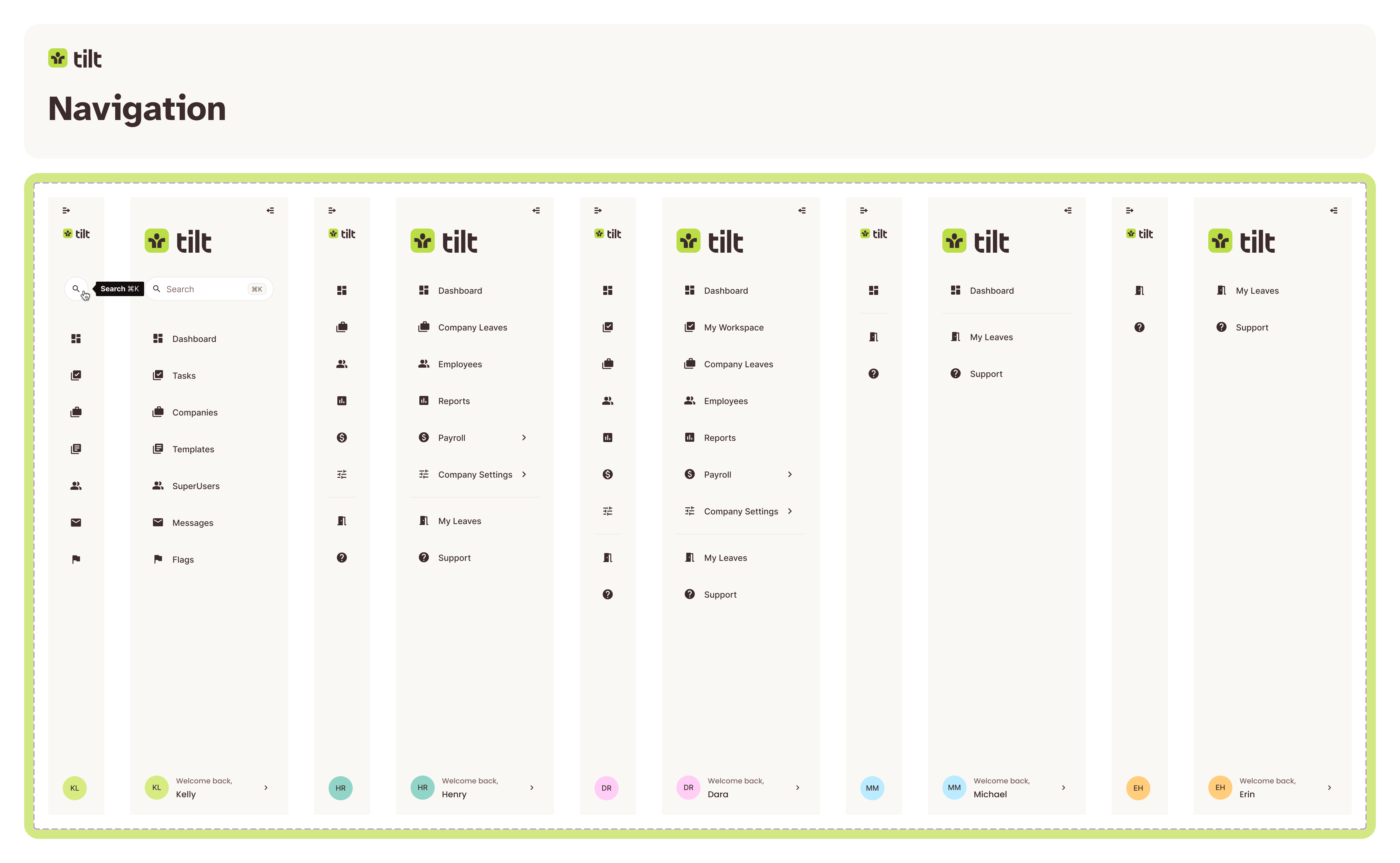
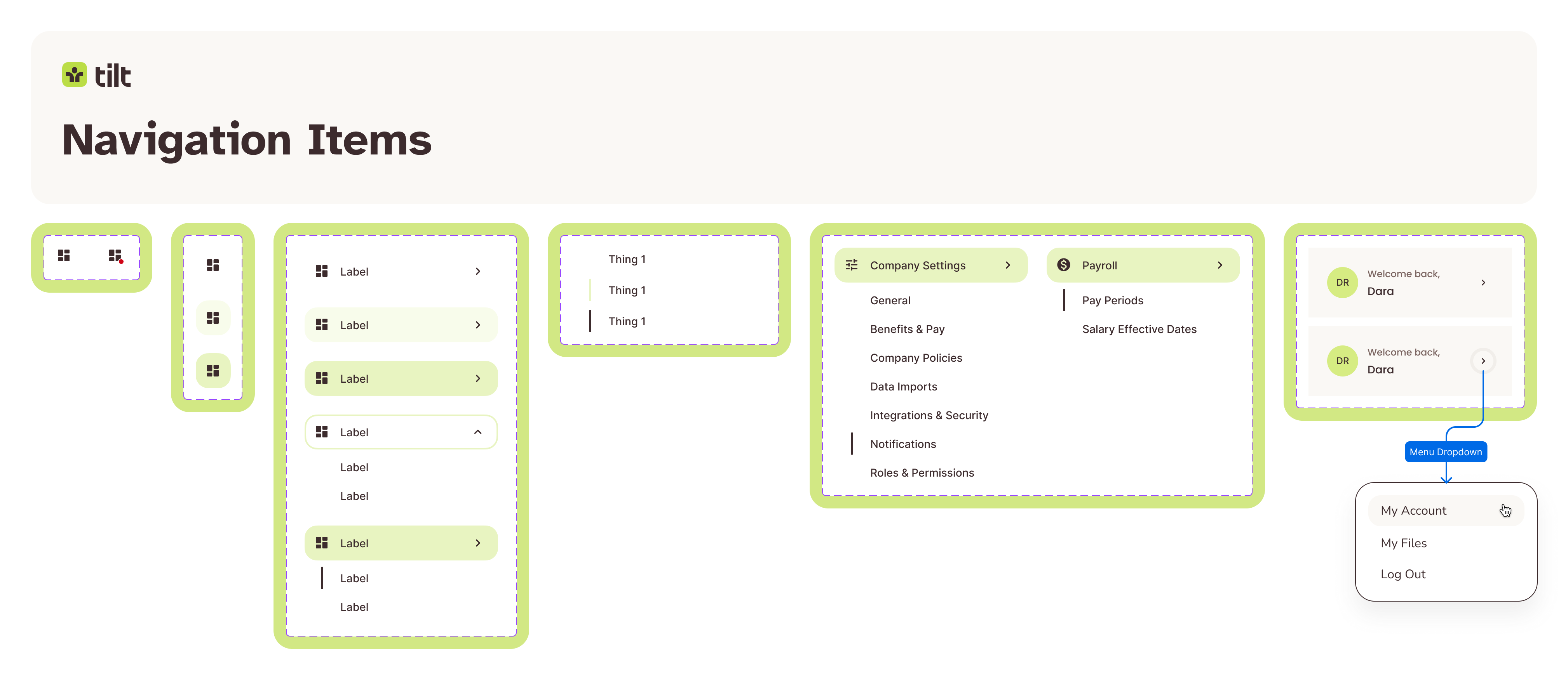
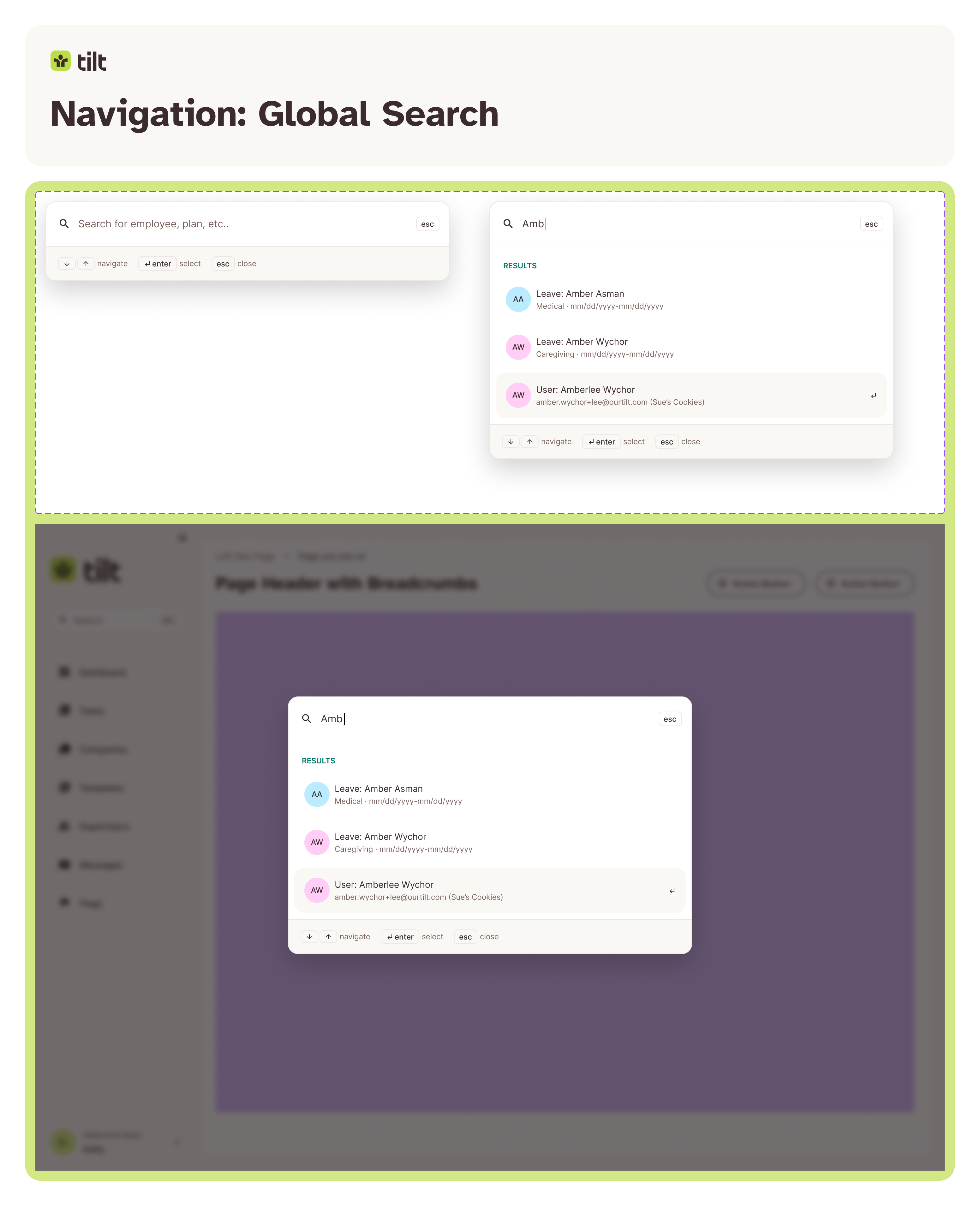
Navigation shows how the system comes together: a shared structure with expanded and collapsed variants, different destinations for different users, and consistent interaction states.
The outcome
A shared foundation for design and engineering.
This gave us control over our design file health while providing Engineering with industry-standard component logic they already understood.